small business website design 15 min read
Small Business Website Design That Converts
Small business website design guide focused on conversions. Learn the structure, CTAs, mobile setup, SEO basics, and analytics wiring that turn visits into
On this page
- Most Small Business Sites Look Fine and Still Leak Leads
- Do You Actually Need a Full Website Yet
- Page-by-Page Structure That Earns the Click
- Speed, Mobile, and Forms Owners Should Demand
- Local SEO Basics Built Into the Design
- Wiring Analytics and SMS Follow-Up So Leads Land
- Your 30-Day Launch Checklist and Final FAQ
A small business site that gets leads usually makes two decisions early: it uses one primary CTA above the fold and repeats it throughout the page, and it treats page speed as a conversion variable rather than a developer chore. A one-second delay can reduce conversions by about 7%, so visual polish can't compensate for a slow, unclear buying path.
The owner usually discovers the problem after launch. The site looks professional on a laptop, the logo sits neatly in the header, and the homepage has the right brand colors. Then the traffic arrives, visitors browse for a moment, and the phone stays quiet.
That outcome isn't a branding problem. It's a systems problem. A useful small business website design connects a visitor's first click to a clear offer, a frictionless contact method, accurate tracking, and prompt follow-up. The visuals support that system, but they don't replace it.
Most Small Business Sites Look Fine and Still Leak Leads
A local-service owner launches a new website after weeks of reviewing fonts, photos, color palettes, and page layouts. The homepage looks clean. The services are listed. The contact page works when the owner tests it from the office computer.
Three months later, the inbox is quiet.
The problem often starts in the hero section. A full-width photograph of a smiling technician or a beautifully finished kitchen takes up most of the first screen, while the actual offer sits in a vague sentence beneath it. The visitor has to work out what the company does, whether it serves their area, and what to do next.
Then the navigation makes the decision harder. A small plumbing company might put About, Blog, Gallery, Careers, Resources, Reviews, Financing, Service Areas, and several minor services in the main menu. Those pages may all have a place somewhere, but they compete with the action that produces revenue.
A third leak is the missing primary CTA. The site says “Learn More” in one place, “Get in Touch” in another, and “Contact Us” in the footer. None of those labels tells the visitor what happens next. The phone number may be visible on desktop but buried in the footer on mobile.
Practical rule: Every important page should make the next useful action obvious without asking the visitor to hunt for it.
A conversion-focused site gives the visitor a direct route from problem to inquiry. That route may be a quote request, a booking, a phone call, or a text conversation. The page should make that action prominent, repeat it after the key proof points, and confirm what the visitor can expect after submitting.
The conversion funnel optimization guidance from BenjiAds follows the same operational logic. Traffic is only the input. The site must turn that input into an identifiable event that someone can respond to.
Page speed belongs in the same category. Portent's analysis of site speed and revenue reports pages loading in one second converting at about 39%, compared with about 22% at five seconds. The practical response is to optimize the homepage and campaign landing pages first, compress images, remove scripts that delay rendering, and measure changes against form submissions, calls, or bookings.
The two choices that separate a lead system from a decorative brochure are straightforward: choose one dominant CTA and repeat it, then treat speed as measurable conversion infrastructure.
Do You Actually Need a Full Website Yet
Not every small business needs a ten-page website at launch. A focused landing page can be the more responsible choice when the business has one core offer, one service area, and a small set of closely related services.
The case for starting small is stronger than generic website advice suggests. In 2025, 83% of U.S. small businesses had websites, while 17% did not, and 84% of non-owners gave reasons other than cost, including the belief that a website wasn't relevant to their industry, according to recent small-business website data. The decision isn't about whether to have a website. It's about whether the business needs a full information architecture or a focused path to one commercial action.
A single-page funnel concentrates the offer, proof, objections, service area, and CTA in one controlled journey. It also makes attribution easier because a visitor has fewer competing paths. A multi-page site creates room for distinct services, search topics, locations, and buyer questions, but it demands more copy, more maintenance, and more decisions from the visitor.
| Factor | Single-Page Funnel | Multi-Page Site |
|---|---|---|
| Primary use | One offer or one campaign | Several services, audiences, or locations |
| Content demand | Concentrated and limited | Broader, with separate page requirements |
| Lead attribution | Simple path from visit to action | Requires page and source-level tracking |
| Launch approach | Faster to plan and publish | More involved structure and quality control |
| Best next step | Quote, call, booking, or message | Service discovery, research, and multiple actions |
Average websites convert around 2% to 5% of visitors, while landing pages average around 9.7%, as summarized in the Revamp data. Those figures don't guarantee a result, but they illustrate why a focused page can outperform a feature-heavy site when the offer and audience are narrow.
Scale into a multi-page build when the business expands into separate service lines, distinct buyer groups, additional locations, or ongoing content marketing. Don't add pages just to make the navigation look substantial.
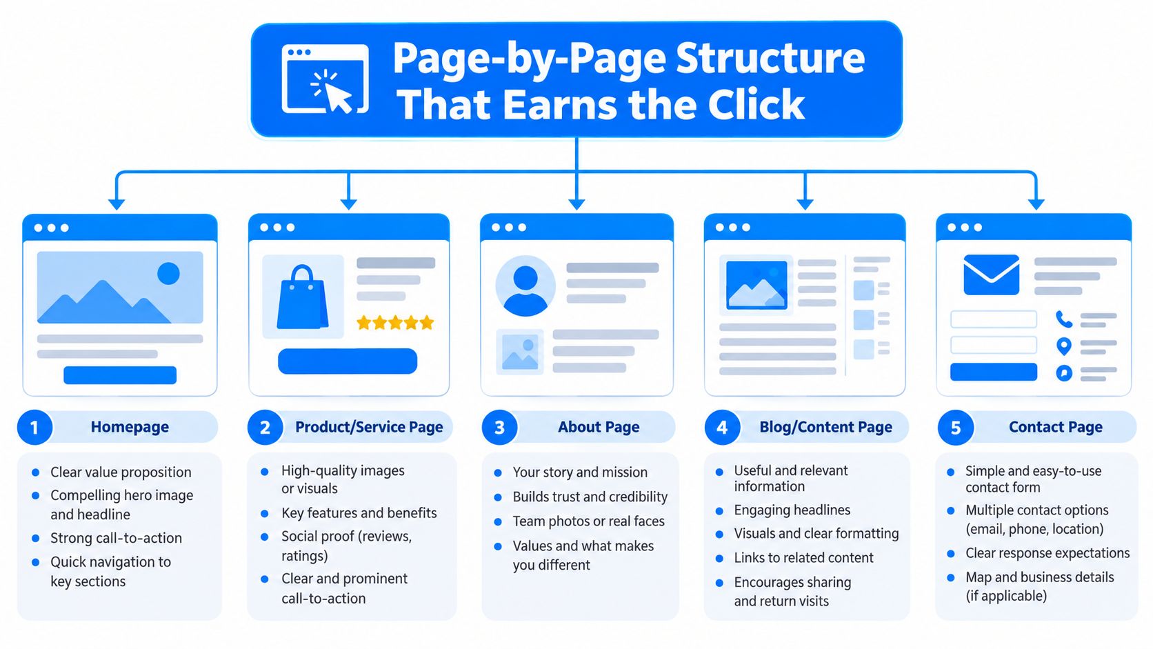
Page-by-Page Structure That Earns the Click
A multi-page site should give every page a defined job. If a page can't explain what it helps the visitor decide or do, it probably doesn't belong in the primary journey.
The homepage should route attention
Start with one offer, one outcome, and one CTA. The hero needs a clear headline, a short supporting explanation, and one relevant image. A photo of the actual team, equipment, property type, or finished work usually supports trust better than a generic stock image, provided it doesn't slow the page.
Follow the hero with a compact trust strip, three benefit blocks, service previews, proof, and a closing CTA band. The homepage isn't a storage area for every fact about the company. Its job is to move a qualified visitor toward the service page, phone call, booking form, or quote request.
Service pages should answer buying questions
A service page earns its click by reducing uncertainty. Lead with the customer's desired outcome, then explain what the service includes, who it's for, and what happens after the inquiry.
Include:
- Scope: List what the customer receives and what the team handles.
- Pricing context: Give a starting point or explain which variables affect the quote.
- Proof: Add testimonials, project photos, certifications, or relevant experience.
- Objections: Use FAQs to address timing, access, guarantees, preparation, and service areas.
- Action: Keep a visible call, form, or booking CTA available as the visitor reads.
The AI landing page builder resource is relevant when a business needs to create a focused campaign page without building an entire site around one offer. The technology matters less than whether the resulting page has a clear promise and a working handoff to the business.
About and Contact pages complete the handoff
The About page should begin with the buyer's concern, not the founder's biography. Explain the problem the team solves, then provide the relevant track record, process, values, and people behind the work. A long origin story has value only after the visitor understands why the company is qualified to help.
The Contact page should remove friction. Use a short form, click-to-call functionality, an SMS option where appropriate, business hours, and a clear service-area note. Tell the visitor what happens next, such as when someone will respond or what information to prepare. A contact detail hidden in the footer isn't a lead process.
Speed, Mobile, and Forms Owners Should Demand
Technical performance is part of the sales experience. A visitor doesn't separate “design” from “development” when a page jumps during loading, a button sits below an oversized image, or a form fails after submission. The visitor concludes that the business feels difficult to deal with.
Portent's research summary connects speed directly to conversion behavior. It reports that improving load time by 0.1 seconds can lift conversions by 8% for retail sites and 10.1% on mobile, while noting that a one-second delay can reduce conversions by about 7%. Those findings support a practical build order: optimize the homepage and highest-traffic landing page first, then test changes against real conversion events.
Keep the page light and stable
Compress hero images before upload. Serve modern image formats where the platform supports them, assign image dimensions so the layout doesn't shift, and lazy-load media that sits below the initial viewport. System fonts or carefully limited font files reduce unnecessary requests, while removing unused plugins and render-blocking scripts keeps the browser's first task smaller.
Don't measure speed only from the office laptop. Test the mobile layout on a real connection and inspect the page after consent tools, chat widgets, tracking scripts, maps, and scheduling software are installed. Those additions often create the performance problem that wasn't visible in the design mockup.
Design the mobile action first
On a phone, the primary CTA should be easy to see without a long scroll. Buttons need enough space to tap accurately, navigation should expose the core service quickly, and intrusive entry popups should not cover the offer before the visitor understands it.
Forms deserve the same discipline. Ask for the information needed to qualify or respond, such as name, phone number, and a short message or service selection. Every additional field needs a business reason.
| Metric | Target | Conversion Reason |
|---|---|---|
| Main content loading | Fast on mobile connections | Visitors can see the offer and CTA sooner |
| Layout stability | No unexpected movement | Visitors can tap the intended control |
| Image delivery | Compressed, appropriately sized media | Less work for the browser |
| Mobile CTA | Visible and easy to tap | The next action stays available |
| Form behavior | Inline confirmation and owner notification | Visitors know the request went through |
A form should submit reliably, confirm the request on the page, and notify the owner immediately. Test failed submissions, validation messages, duplicate taps, and notifications on both mobile and desktop. A beautiful form that disappears into an unmonitored inbox is not a conversion feature.
Local SEO Basics Built Into the Design
Local SEO starts in the page structure, not in a last-minute plugin checklist. Each important page should target a clear service and location intent, then make the page useful for someone who is deciding whether to call.
Give every page a unique title tag and meta description. A service-and-city combination can clarify relevance when it accurately describes the page, while the description should read like a concise ad, not a string of keywords. Use one H1 that matches the page's purpose, and keep URLs short and descriptive, such as /services/plumbing-repair-austin.
Make the business easy to identify
Add appropriate LocalBusiness structured data with the business name, address, phone number, hours, service area, and other supported details. The markup won't rescue a confusing page, but it gives search engines a clearer machine-readable representation of the business.
The contact page should display the business name, address, and phone number in the exact format used on the Google Business Profile. Add a map when it helps visitors verify the location, but don't let an embedded map become the largest element on the page. Service-area businesses should explain where they work without implying a storefront they don't operate.
Independent audits found that 56.0% of small business sites use structured data, 18.5% use LocalBusiness schema, and 66.4% have a meta description, according to the small-business web design audit. Those figures show that foundational implementation remains inconsistent, even when the business has already paid for a polished visual design.
Connect pages and profiles
Internal links should guide visitors from a service page to a relevant explanation, proof page, or contact action. Use descriptive anchor text that tells the visitor what they'll find next. Image alt text should describe the actual service or scene, with location included only when it adds genuine context.
Connect the Google Business Profile to the site with a tracking-enabled link and matching business categories. Keep the destination page aligned with the profile's promise. Sending every profile visitor to a generic homepage wastes the intent created by the listing.
The design should also support accessibility. Descriptive labels, keyboard-friendly controls, readable contrast, and useful alt text help more visitors move through the page and make the content easier to interpret across devices and assistive technologies.
Wiring Analytics and SMS Follow-Up So Leads Land
A site without measurement leaves the owner arguing from impressions. One person says the new hero looks better, another says the page needs more copy, and nobody can show whether calls or form submissions changed.
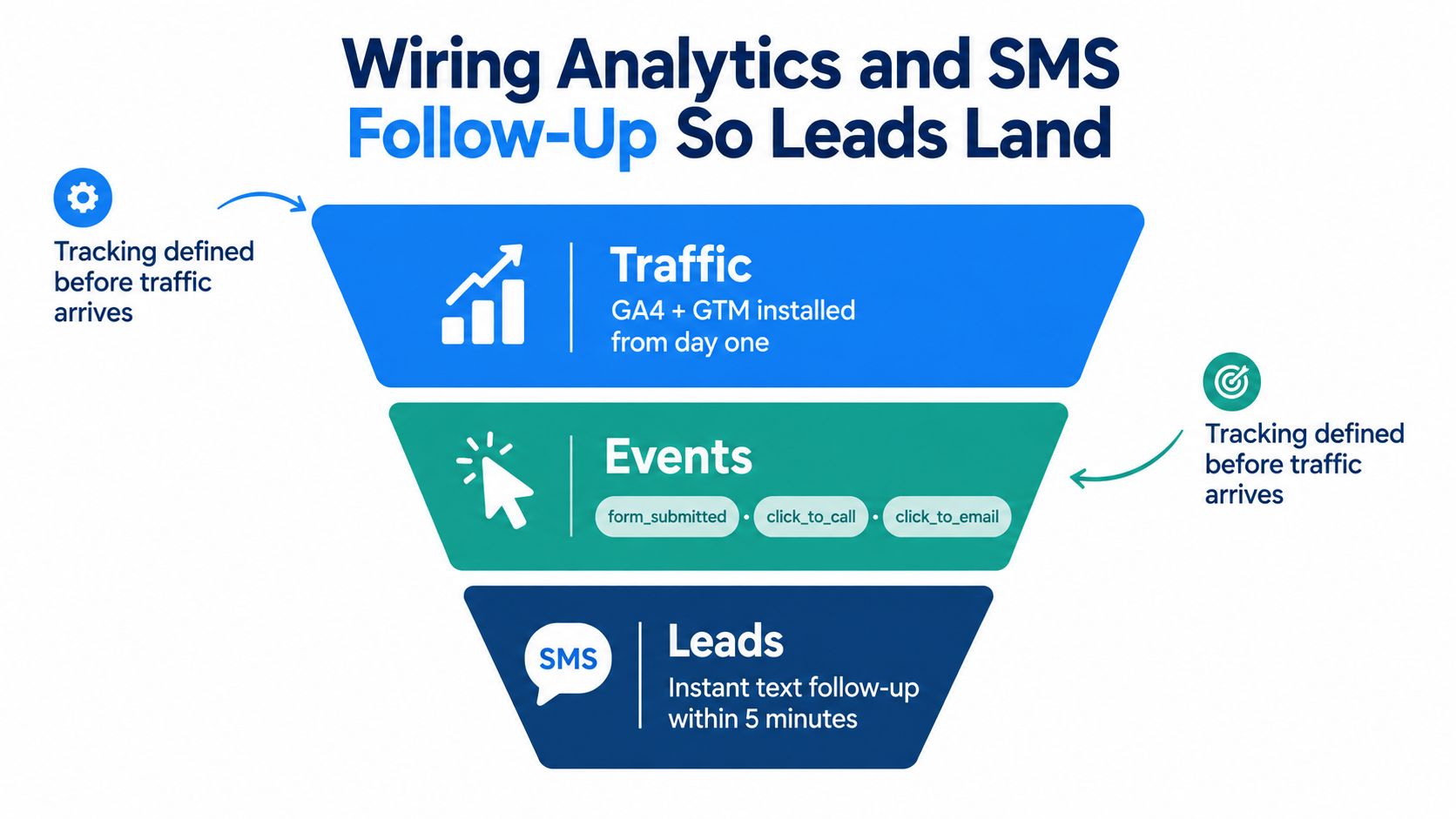
Install GA4 and Google Tag Manager before promoting the site. Define the events first, then build the form and buttons around those events. Useful event names include form_submitted, click_to_call, and click_to_email. A thank-you page or data-layer push can provide a dependable signal, but the team must test that the event fires once and only once.
Track actions instead of page views
Page views describe activity. Conversion events describe intent. Separate phone calls, forms, booked appointments, emails, and SMS conversations so the owner can compare the actions that create real opportunities.
Google Search Console belongs in the same setup. Use it to inspect indexing, search queries, page performance, and field experience. Connect the data to the pages and services that generated it, rather than reviewing a single traffic total that hides which offer attracted the visitor.
Dynamic call tracking can replace a static phone number when attribution matters. The system can associate a call with its source, keyword, or landing page while routing it to the business line. Test number replacement carefully so search engines and customers still see consistent business details where they should.
Make the handoff immediate
An after-hours visitor may not wait for a next-day reply. Add an SMS intake option that posts the conversation or request to the CRM, and make the owner notification clear enough to act on without opening several tools.
A simple speed-to-lead workflow should attach the source, page, and campaign parameters to the CRM record. The owner receives the request, the visitor gets a clear confirmation, and the team can later compare response time with booked work. The speed-to-lead workflow guidance is useful when designing this handoff.
Don't automate a message that promises something the business can't deliver. The first text should confirm receipt, set expectations, and invite the next useful reply. Follow-up sequences should support human contact, not pretend to replace it.
If the owner isn't notified, the funnel ends at the form. If the event isn't recorded, the business can't learn which page or campaign produced the inquiry. If nobody responds, the design has done its job only halfway.
Your 30-Day Launch Checklist and Final FAQ
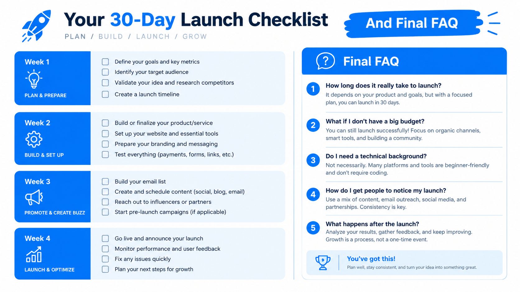
A launch plan should produce verifiable work every week, not another collection of design opinions. Keep the first version narrow enough to test, then improve it with evidence from real visitors and real conversations.
Week 1 builds the commercial path
Write the offer, audience, service area, proof points, objections, and primary CTA. Build the page structure around that decision, then draft the homepage and core service content. By the end of the week, a visitor should understand what the business does, who it serves, and how to start.
Week 2 removes friction
Compress images, remove unnecessary scripts, test the mobile layout, and submit every form. Check click-to-call buttons, confirmation messages, field validation, and owner notifications. The outcome is a stable page that loads quickly, stays visually steady, and doesn't lose a request after submission.
Week 3 makes discovery consistent
Add title tags, meta descriptions, H1s, descriptive URLs, internal links, image alt text, and appropriate LocalBusiness schema. Sync the site details with the Google Business Profile and submit the key pages for indexing. Review every service page for a clear connection between search intent and the next action.
Week 4 makes performance visible
Configure GA4, Google Tag Manager, Search Console, conversion events, call attribution, and SMS intake. Test the full path from source click to CRM record. The finished system should identify where a lead came from, what action they took, and whether the owner received the request.
Common design trade-offs
Custom design or template: Choose a template when the offer is simple and speed matters. Invest in custom work when the business has multiple audiences, complex booking logic, unusual proof requirements, or a clear reason to depart from standard patterns.
Blog or no blog: A single-location service business doesn't need a blog to look legitimate. Publish useful content when it answers recurring customer questions, supports service pages, or creates a reason for local searchers to visit. Don't create thin posts just to fill a menu item.
Professional photography or stock images: Use real photography for the team, vehicles, premises, and completed work when trust depends on seeing the actual operator. Stock imagery can support generic visual context, but it shouldn't imply projects or staff the business doesn't have.
Landing page or full site: Choose a landing page when one audience needs one offer and one action. Choose a full site when separate services, locations, buyer groups, or content goals need their own paths.
A site that looks good but can't show where leads come from is unfinished. A site that tracks everything but makes the offer hard to understand is also unfinished. The durable approach combines clear structure, fast delivery, mobile usability, local relevance, measurable actions, and a follow-up process the owner can realistically run.
Benjiads helps local service businesses create campaign-ready landing pages, lead-capture funnels, conversion tracking, and SMS-based follow-up without requiring the owner to manage every advertising tool manually. If your website needs to connect paid traffic with real conversations and measurable lead handling, visit benjiads and review how the platform fits your next campaign.
- small business website design
- website conversion
- small business SEO
- mobile web design
- call to action
Done for you
Ads that text you customers.
- ✓ Ads created for you
- ✓ Every lead texts your phone
- ✓ Free to use, no credit card
748+ local businesses run ads with benjiads